
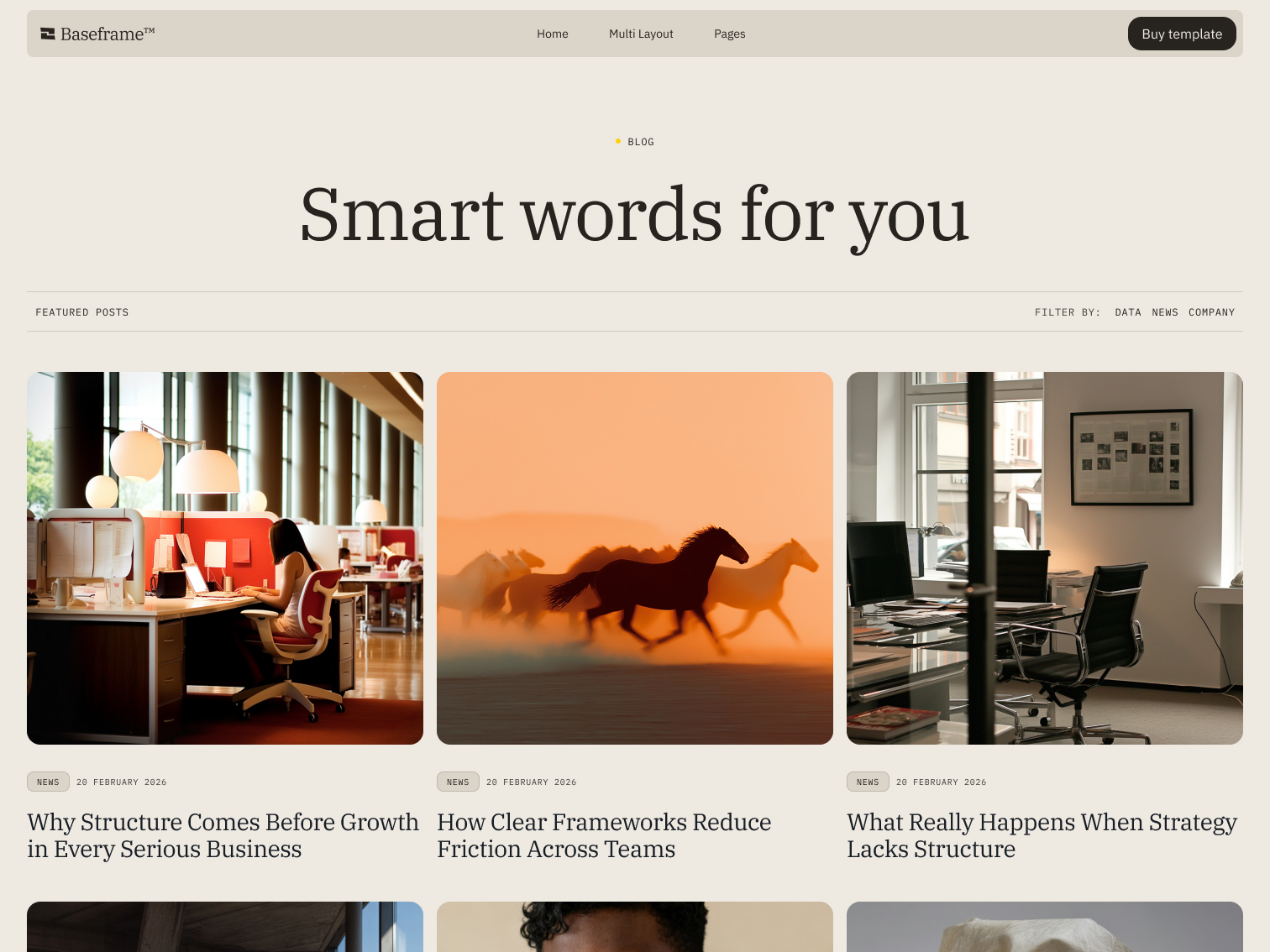




How Clear Frameworks Reduce Friction Across Teams
Vision made structural: how the masculine Creator archetype shows up in art, aesthetics, and brand strategy.

Where the feminine Creator works from feeling, the masculine expression works from structure. It's the same drive to bring something out of nothing, but here the instinct is to plan first: architect the idea, then build it exactly as intended. Here's where it comes from, what it looks and feels like, and which brands are already built on it.
Where the Creator Comes From: Myth, Psychology, and a Little Bit of Astrology
Carl Jung placed the Creator among the archetypes that shape how humans make meaning: the drive to take something formless and give it shape. In its masculine expression, that drive shows up less as inspiration and more as engineering. Less about the spark, more about the delivery.
Astrology and tarot chart similar ground. Taurus, ruled by Venus, still carries the Creator's instinct for craft and quality, but in its masculine expression that shows up as precision and a respect for structure rather than pure sensation. The Magician, its tarot counterpart, represents manifestation: taking an idea and building the bridge to make it real. Where the Empress nurtures, the Magician executes.
None of these systems, psychology, mythology, astrology, exist here for their own sake. They're lenses. A brand that understands which archetype it's built on tells a story people recognize before they can explain why, which is usually the difference between a brand people trust and one they scroll past.
The Masculine Creator in Art and History
This version of the Creator has a long visual history. Le Corbusier applied near-mathematical precision to modern architecture. Leonardo da Vinci moved fluidly between art, engineering, and invention, treating each as an extension of the same instinct. Zaha Hadid built with that same structural ambition and scale, proof this archetype was never reserved for men in the first place. What connects all three is discipline. Nothing in their work reads as accidental.
What It Looks, Feels, and Sounds Like
Sight: clean grids, architectural photography, deep neutrals and sharp metallics, precision in every proportion
Touch: glass, brushed metal, leather, matte finishes with almost no texture to spare
Sound: a steady rhythm, the click of a pen, a voice that doesn't need volume to carry conviction
Smell: cedarwood, tobacco, leather, vetiver, something clean with an edge
Feeling: trust, capability, the sense that nothing here was left to chance
Brands Already Building on This Archetype
Apple (minimalism with intention): Apple's design language runs on restraint. Every unnecessary element gets removed before a product ships, and the brand's entire identity is built on that discipline rather than on decoration.
Monocle (curated by design): Monocle treats its editorial and product lines with the same rigor. Nothing runs unless it's been considered from every angle first.
Patagonia Provisions (built to last): Patagonia Provisions applies structural thinking to sustainability itself, building supply chains and products meant to hold up over decades, not seasons.
Where Does Your Brand Fit?
Maybe the Creator is your brand's underlying pattern, especially if what you're building runs on precision, systems, or ideas that need to be executed exactly as intended. Maybe it's something else entirely. Either way, naming it is the first step toward building something people recognize without needing to be told what it means.
If you haven't already, it's worth reading the feminine expression of this same archetype. The difference in how each one builds is sharper than you'd expect.
Get in touch and we'll help you figure out which one is yours.