



















Our philosophy
We start with the argument, not the layout.
We have refined this process across hundreds of projects. You get a direct, low-friction experience from brief to final file.
01 Content review and editorial structuring
You provide your source material: data sets, research documents, process descriptions, or a written brief. We review it thoroughly, identify the core argument or hierarchy of information, and produce an editorial outline — the structure the infographic will follow — before any visual design begins. We share this with you for alignment before we proceed to design.
02 Format and approach
Based on the editorial structure and the intended use of the piece, we recommend the format — data visualisation, process diagram, editorial explainer, comparison matrix — and the approximate layout approach. You confirm direction before design starts.
03 Visual design
We design the full infographic within your brand system. You review at the completed draft stage and provide consolidated feedback. For longer or more complex pieces, a midpoint check-in is built into the timeline.
04 Refinement and delivery
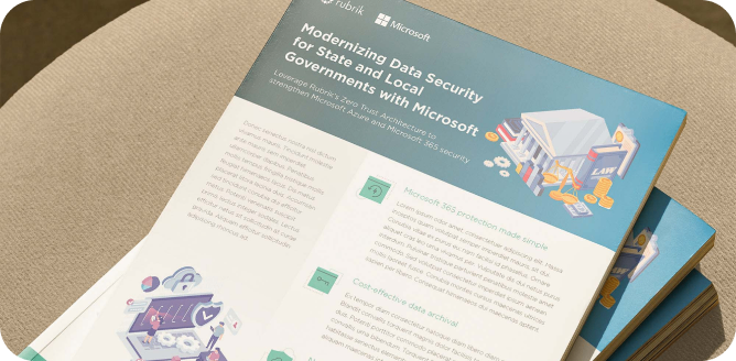
One consolidated feedback round is included. We incorporate your notes, finalise the design, and deliver in the formats you need: high-resolution PNG and PDF for print and web, and editable source files where required. If the piece will be used across multiple formats or sizes, we prepare each version.