








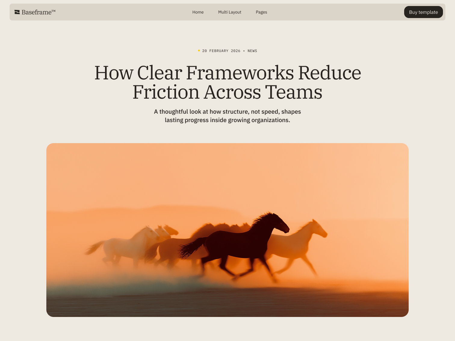






How Clear Frameworks Reduce Friction Across Teams
Truth in disguise: how the masculine Jester archetype shows up in art, aesthetics, and brand strategy.

The masculine Jester isn't chaotic for its own sake. He's the one who points out what's broken with a smirk instead of a lecture, and gets away with saying things other people can't because he says them as a joke first. In its masculine expression, that instinct is calculated: sharp timing, a clear target, and a punchline that does the real work. Here's where it comes from, what it looks and feels like, and which brands are already built on it.
Where the Jester Comes From: Myth, Psychology, and a Little Bit of Astrology
Carl Jung connected the Jester to the shadow: the part of a person that questions authority and pokes at ego rather than falling in line with it. Myth carries the same instinct through Mercury, the trickster god of communication, and later through court jesters and comedians, historically some of the only people allowed to say the unsayable, as long as it landed as a joke.
Astrology and tarot chart similar ground. Gemini, ruled by Mercury, carries the Jester's duality: intellect and mischief, truth and performance, in the same sentence. The Fool, its tarot counterpart, represents freedom taken without asking permission first. In its masculine expression, the Jester also leans on The Magician, someone who knows exactly how to work a room and redirect attention on purpose.
None of these systems, psychology, mythology, astrology, exist here for their own sake. They're lenses. A brand that understands which archetype it's built on tells a story people recognize before they can explain why, which is usually the difference between a brand people remember and one they scroll past.
The Masculine Jester in Art and History
This version of the Jester shows up in artists who used humor as a weapon rather than a distraction. Banksy turns graffiti into a mirror held up to whatever institution happens to be nearby. Andy Kaufman built an entire career out of never quite letting an audience know if the joke was real. Keith Haring folded complex political and social themes into visual language simple enough for a subway wall. None of them were being funny for its own sake. The joke was the delivery system for something sharper underneath.
What It Looks, Feels, and Sounds Like
Sight: contrast-heavy palettes, graffiti and stencil marks, layouts that look deliberately unfinished
Touch: velcro, rubber, denim, sandpaper, something a little rough on purpose
Sound: a podcast mid-punchline, a beat that drops right when you expect it not to
Smell: spray paint, ink, street food, something synthetic with an edge
Feeling: the specific discomfort of laughing at something before realizing it was true
Brands Already Building on This Archetype
Liquid Death (absurdity as strategy): Liquid Death sells water like it's a dare. The entire brand runs on refusing to take the beverage aisle seriously, which is exactly what makes it stand out inside it.
Old Spice (hyperbole with a plan): Old Spice rebuilt an entire legacy brand around absurdist humor, and the strategy underneath the jokes was as calculated as any repositioning campaign in the category.
Cards Against Humanity (provocation by design): Cards Against Humanity built a business on saying the thing other games wouldn't. The irreverence isn't incidental. It's the entire product.
Where Does Your Brand Fit?
Maybe the Jester is your brand's underlying pattern, especially if what you're building runs on wit, timing, or a willingness to say the thing everyone else is only thinking. Maybe it's something else entirely. Either way, naming it is the first step toward building something people recognize without needing to be told what it means.
If you haven't already, it's worth reading the feminine expression of this same archetype. The difference in how each one disrupts is sharper than you'd expect.
Get in touch and we'll help you figure out which one is yours.