
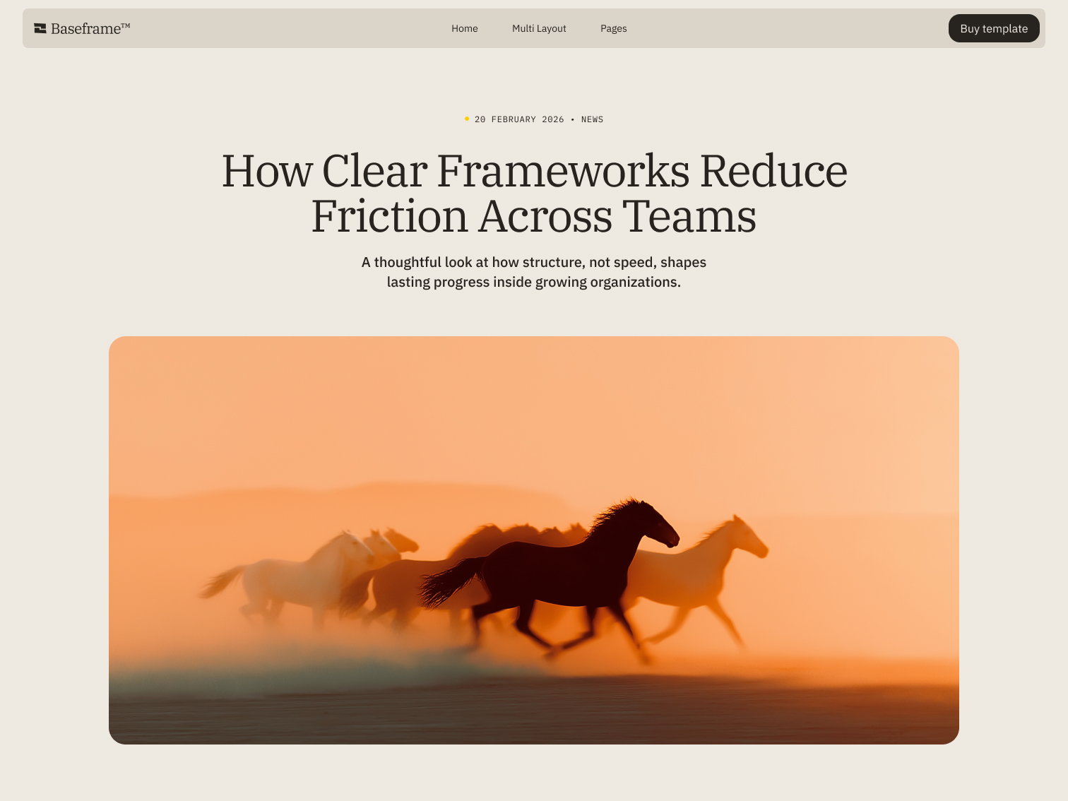




How Clear Frameworks Reduce Friction Across Teams
Courage without a sword: how the feminine Hero archetype shows up in myth, aesthetics, and brand strategy.
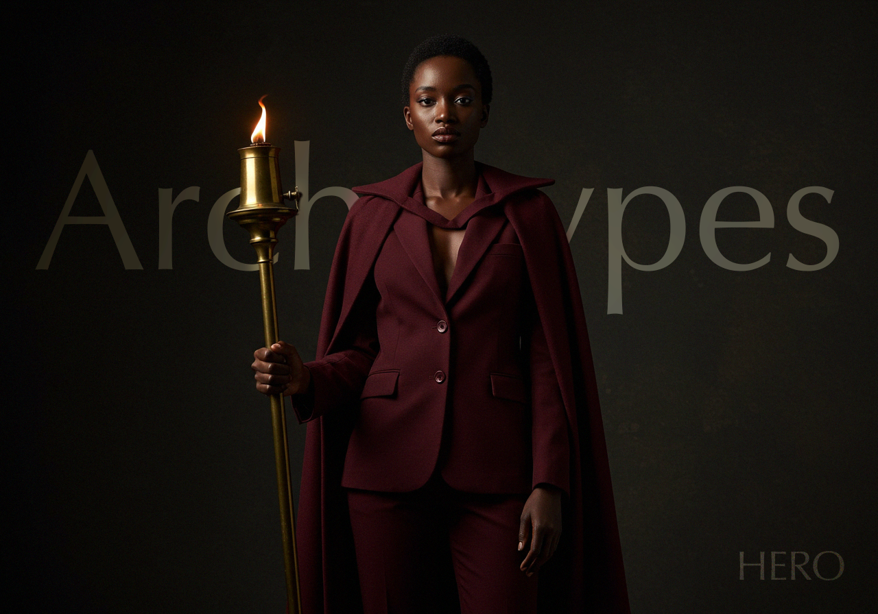
The Hero archetype gets reduced to armor and swords more often than not. But there's another version of it running through myth, psychology, and now branding: one that leads with grace instead of force, and proves its strength through persistence rather than conquest. Here's where that version comes from, what it looks and feels like, and which brands are already building on it.
Where the Hero Comes From: Myth, Psychology, and a Little Bit of Astrology
Carl Jung named the Hero as one of the archetypes running underneath human storytelling: the drive to face a threat, grow because of it, and come out the other side changed. You can trace it through Greek mythology, Hindu epics, and every underdog film made since. It's a pattern old enough that most of us stopped noticing we were repeating it.
Astrology and tarot chart the same territory. Aries, the first fire sign, carries the Hero's boldness and its refusal to wait for permission. The Emperor, its tarot counterpart, represents structure and forward motion. But the feminine expression of this archetype isn't interested in domination. Its strength shows up as resilience, emotional intelligence, and leadership that reads a room instead of forcing it.
This matters for brand work because none of these systems, psychology, mythology, astrology, exist here for their own sake. They're lenses. A brand that understands which archetype it's built on tells a story people recognize on a level they can't always name, which is usually the difference between a brand people remember and one they don't.
The Feminine Hero in Art and History
This version of the Hero shows up throughout history in people who led without waiting to be handed authority. Joan of Arc moved an army on conviction alone. Frida Kahlo turned physical pain into some of the most recognized visual language of the twentieth century. Neither fit the warrior mold, and neither needed to. Their strength lived in self-belief and a refusal to let circumstance write the ending.
What It Looks, Feels, and Sounds Like
Sight: bold typography, fire reds and deep golds, structure that holds its shape
Touch: leather and metal softened by suede, strength with give
Sound: a drumbeat, or the quiet weight of a voice that doesn't need volume to carry
Smell: cinnamon and clove, warmth with an edge to it
Feeling: momentum, direction, the sense of something already in motion
Brands Already Building on This Archetype
Athleta (strength in motion): Athleta's branding leans into structure without losing fluidity: typography that moves, imagery built around real effort, and a line like “Power Through” that says exactly what it means. Nothing about it oversells. It just shows women mid-motion.
Haus Labs (beauty as rebellion): Haus Labs built its identity around refusing beauty's usual rules. Bold color, campaigns that don't soften their edges, language that treats self-expression as the point rather than the byproduct.
Bumble (confidence as the default): Bumble flipped a category's oldest assumption by putting women in the position to lead first. The aesthetic is warm rather than aggressive, but the message underneath it is decisive.
Where Does Your Brand Fit?
Maybe the Hero is your brand's underlying pattern. Maybe it's one of the other archetypes entirely. Either way, naming it is the first step toward building something people recognize without needing to be told what it means.
Get in touch and we'll help you figure out which one is yours.