

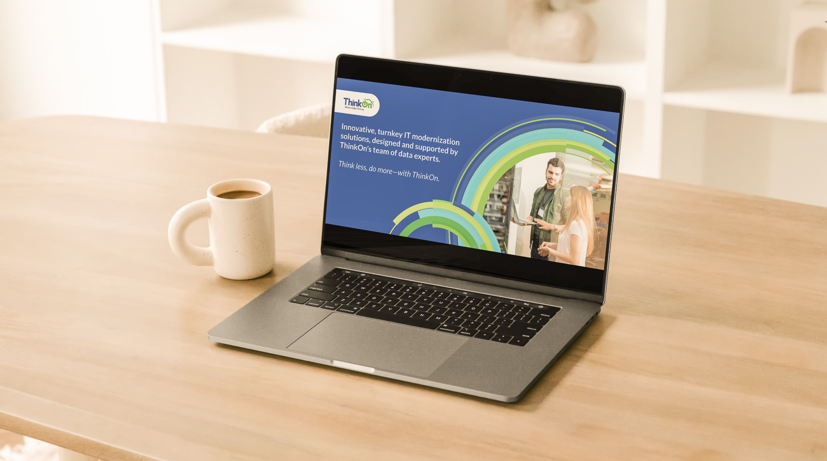

Built distinct campaign visuals for a technology brand without breaking from its core identity.
ThinkOn wanted every new initiative to stand out with its own personality, yet always feel unmistakably part of the brand.
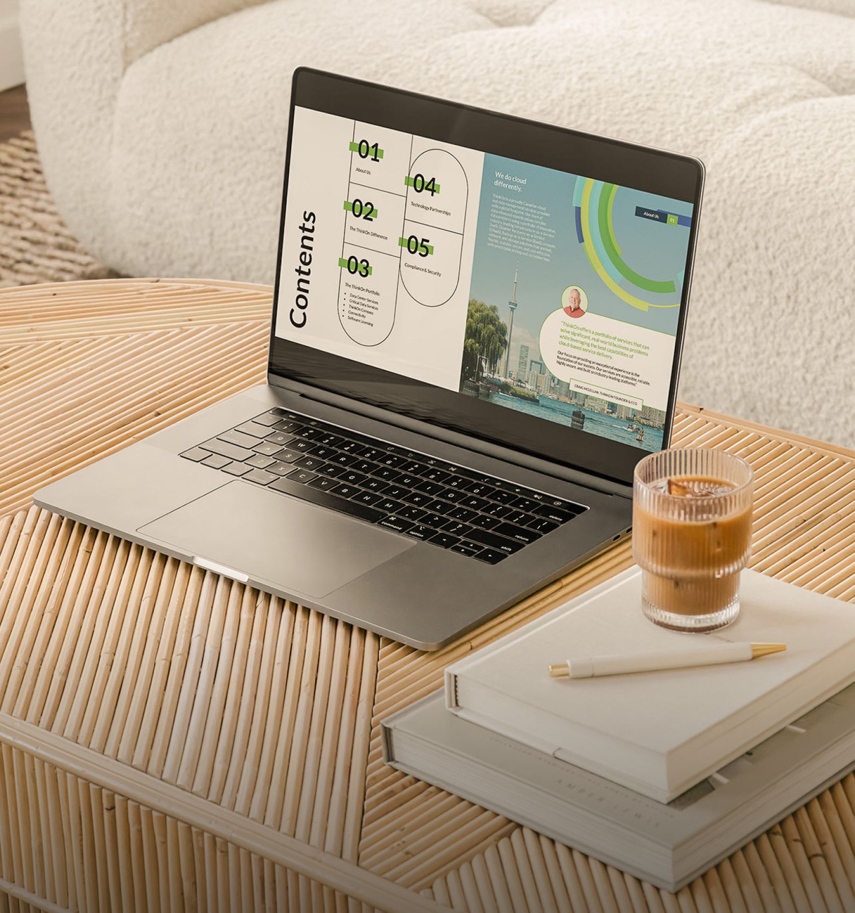
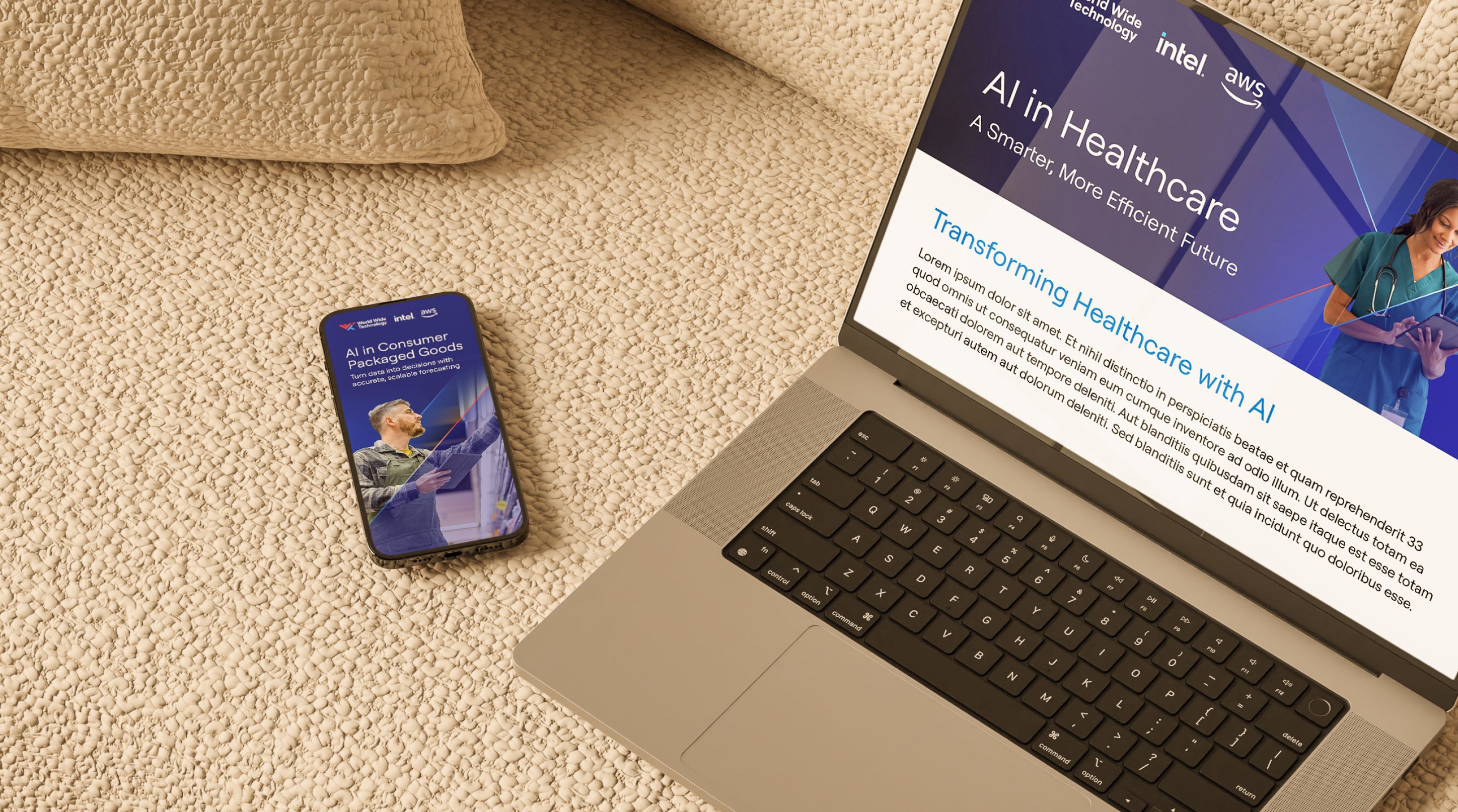
ThinkOn needed a brochure, partner badges, and supporting materials, each with a unique visual twist for different initiatives and campaigns, yet all instantly recognizable as ThinkOn. The real challenge was to create enough visual variety so nothing felt repetitive, but not so much that any piece lost its connection to the brand.
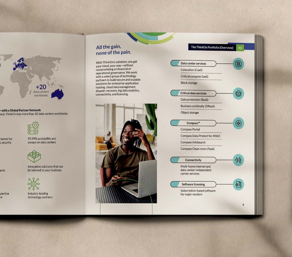




One brand, many patterns: a dynamic system woven from ThinkOn's signature colours and bold shapes.
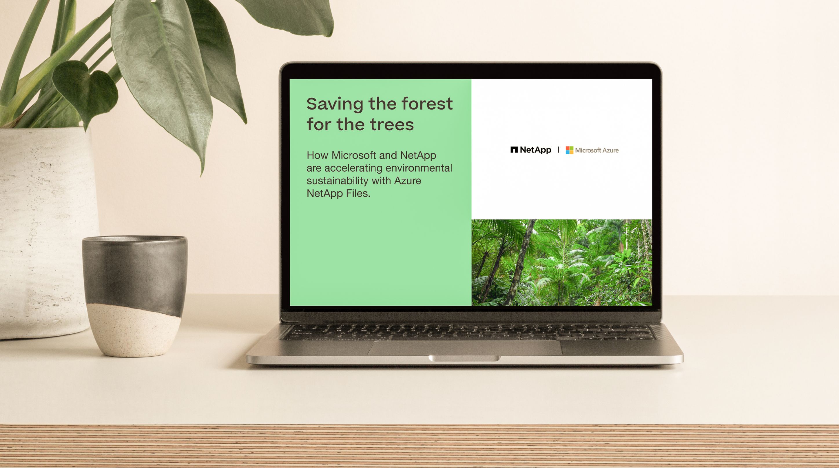
We crafted each element by remixing ThinkOn's colours into fresh patterns and shapes, so every asset stands out with its own personality yet remains unmistakably part of the family. The badges were designed to fit effortlessly wherever partners used them, while the brochure and supporting materials echoed this approach: unique enough to spotlight each initiative, yet always true to the brand.
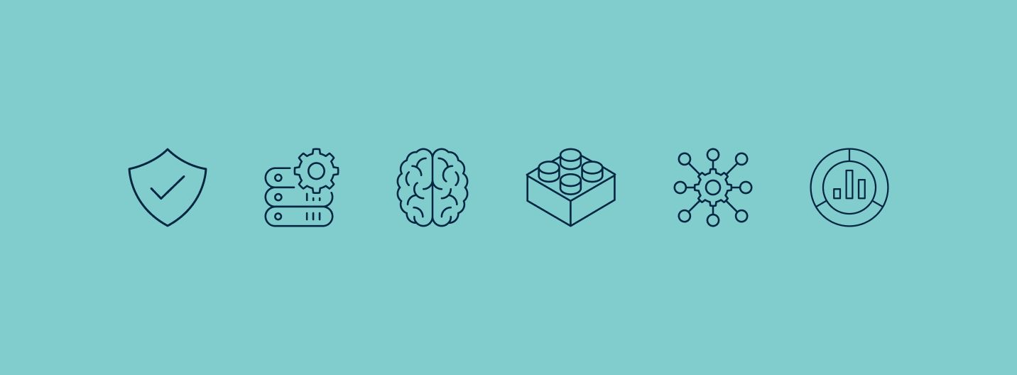


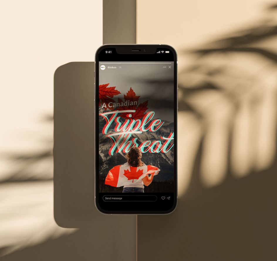
Reusable materials empower the team to launch campaigns swiftly, eliminating the need to reinvent designs every time.
ThinkOn now offers a suite of ready-to-use templates for every campaign and partner-ready badges that deliver a unified look across the entire partner channel. Every new initiative can tap into this adaptable system, making blank-page beginnings a thing of the past.